Changelog: RainbowApple 2.0.11 and 2.0.12

Photo by Jakub Żerdzicki on Unsplash
RainbowApple is the smallest thing I ship. It puts the 1977 six-colour Apple logo back where it belongs — over the grey one in the corner of your menu bar — and then it does nothing else, forever. There is no feature roadmap. There is no second screen. The entire product is one glyph, painted correctly, in exactly the right place.

Which means when it goes wrong, it goes wrong in one of only two ways: the place is wrong, or the painting is wrong.
Yesterday both were.
Part one: the disappearing rainbow
The symptom was reported by me, to me, while doing something else entirely. I had Ballast open — it has a little audio visualiser window — and out of the corner of my eye the rainbow blinked out. Grey Apple logo. System default. As though the app had quit.
It hadn’t. It was still running, still drawing, still perfectly happy. It had simply resized itself to nothing.
To answer the obvious question: Ballast didn’t change. It has been untouched since the 25th of July. It wasn’t the culprit, it was the witness — the one app in my menu bar with the specific shape needed to expose a bug latent in RainbowApple since the day it was written.
How the overlay finds its spot
RainbowApple doesn’t guess where the Apple logo is. That was a deliberate decision early on, and I still think it’s the right one: there are no magic offsets in this app, no x + 8 fudge, nothing tuned by eye on my machine that quietly breaks on yours. Instead it asks the Accessibility API for the actual on-screen rectangle of the actual Apple menu item, and puts the window there.
The original code asked the frontmost application:
var menuBarRef: AnyObject?
if let frontApp = NSWorkspace.shared.frontmostApplication {
    let el = AXUIElementCreateApplication(frontApp.processIdentifier)
    AXUIElementCopyAttributeValue(el, kAXMenuBarAttribute as CFString, &menuBarRef)
}
if menuBarRef == nil {
    // Fall back to Finder, which is always running.
}
guard let menuBar = menuBarRef else { return nil }
Whoever is frontmost owns the menu bar, so whoever is frontmost knows where the Apple item is. For a year and a bit, that held.
The thing that isn’t there
Menu-bar utilities are agent apps. In the plist they’re marked LSUIElement; in code they report an activation policy of .accessory. They have no Dock icon, no window in the switcher, and — crucially — no menu bar. They never draw one. There is nothing up there that belongs to them.
But AppKit doesn’t know that, or doesn’t care. It hands every application a main menu whether it will ever be shown or not. So when you ask an agent app’s Accessibility interface for its menu bar, the call doesn’t fail. It succeeds. You get back a menu bar element, with children, and the first child is titled “Apple”, exactly as you’d hope.
Its size is 0 × 0.
I went and measured this properly rather than trusting one sighting, and it’s not a quirk of one app — it’s universal. Every accessory app running on my Mac reported the same phantom: MirrorGuard, QuitProtect, CalendarUpcoming, ShortcutHUD, Lookout, ActiveSpace, Ballast, and several of Apple’s own background agents. All of them claim an Apple menu item at position (0, 30) with zero width and zero height. Only an app that genuinely owns the drawn bar returns the real thing — on my 2560×1440 primary display, (10, 1410, 34, 30).
So the old code was correct in every case but one: an agent app becomes frontmost. RainbowApple asks it politely for the Apple item’s frame, receives a rectangle of nothing, and dutifully resizes the overlay to nothing. The system logo shows through. Nothing has crashed. The app has done exactly what it was told.
Ballast was the trigger because it’s the one agent app I run with a real, focusable window — the visualiser calls activate(ignoringOtherApps:) when you open it, so an app with no menu bar becomes the frontmost app. Most menu-bar utilities never do that. Ballast does, and so Ballast found the bug.
And it stuck, which made it feel worse than it was. The overlay caches the last good frame so it has something sensible to fall back on during a Space switch. The zero-sized frame sailed straight into that cache, so even after Ballast lost focus, the bad rectangle was the one being remembered.
The fix, in two halves
The first half is asking the right app. There’s an API for precisely this question, and I wasn’t using it:
var candidates: [pid_t] = []
if let owner = NSWorkspace.shared.menuBarOwningApplication {
    candidates.append(owner.processIdentifier)
}
if let front = NSWorkspace.shared.frontmostApplication,
   front.activationPolicy == .regular {
    candidates.append(front.processIdentifier)
}
if let finder = NSWorkspace.shared.runningApplications.first(where: {
    $0.bundleIdentifier == "com.apple.finder"
}) {
    candidates.append(finder.processIdentifier)
}

for pid in candidates {
    if let frame = appleMenuFrame(ofProcess: pid), isOnMenuBar(frame) { return frame }
}
return nil
menuBarOwningApplication is the one that answers the question I actually meant to ask. It stays pinned to the app that owns the bar you can see, and it does not follow focus to an accessory app — which is exactly the transition that broke things. Frontmost is still consulted, but only if it’s a .regular app, which is the same test that excludes the phantoms. Finder brings up the rear, because Finder is always running and owns the bar when nothing else does — after a synthetic Space switch, say, when briefly nothing has focus.
The second half matters more, because the first half is only ever as good as my model of how macOS behaves, and yesterday demonstrated what that’s worth. So no frame is trusted now unless it survives a check: it must be non-empty, and it must actually land in a menu bar.
private func isOnMenuBar(_ frame: NSRect) -> Bool {
    guard !frame.isEmpty else { return false }

    let strips = NSScreen.screens.compactMap { screen -> NSRect? in
        let thickness = screen.frame.maxY - screen.visibleFrame.maxY
        guard thickness > 0 else { return nil }   // this screen isn't drawing a bar
        return NSRect(x: screen.frame.minX, y: screen.frame.maxY - thickness,
                      width: screen.frame.width, height: thickness)
    }
    ...
    return strips.contains { $0.intersects(frame) }
}
A zero-sized rectangle at the origin fails on the first line. Anything else has to intersect a real menu-bar strip on a real screen, and the same validation now guards the cache — so a bad frame can neither move the overlay nor be remembered.
While I was in there: the ruler was lying too
I needed the height of the menu bar to build those strips, and there is an obvious API for that: NSStatusBar.system.thickness.
It said 22.
The bar on my Mac, running macOS 26, is 31 points tall.
That is not a rounding error, it’s a whole different bar. And it illustrates why this app has always avoided constants: the README used to state, quite confidently, that menu bars are 22pt on external displays and 24pt on notched MacBook Pros. Both figures were true when I wrote them. Neither is universally true now, and I have no reason to believe 31 will be true in two years.
So nothing is assumed. The thickness is derived per screen, from the screen:
let thickness = screen.frame.maxY - screen.visibleFrame.maxY
frame is the whole display; visibleFrame is what’s left after the system has taken its share off the top. The difference is the bar, measured from the thing that actually drew it, on whichever display you’re looking at. It costs one subtraction and it can never be out of date.
There is one edge case that needs its own answer. If you’ve set the menu bar to auto-hide and it’s currently hidden, visibleFrame extends to the top of the screen and the measured thickness is zero — there genuinely is no strip to be in. So when no screen reports a bar at all, the check falls back to the one property still true of a real Apple item: its top edge sits flush with the top of a screen.
That shipped as 2.0.11, and the README grew a paragraph explaining that the frame comes from whichever app owns the bar rather than whichever app has focus. Documentation for these apps is a promise, not a courtesy — if the code learns something, the README learns it the same day.
Part two: five colours on a six-colour apple
Now the embarrassing one.
With the vanishing fixed, I had the logo on screen and steady, and I did the thing I should have done a year ago: put my own render next to the 1977 original, magnified, and looked properly.
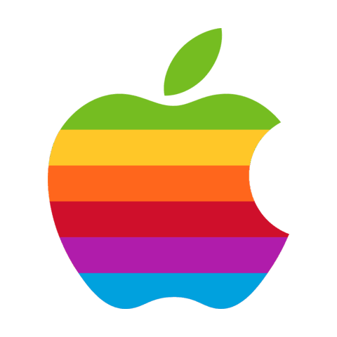
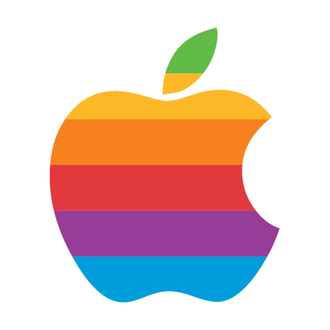
The shoulder of my apple — the round part at the top right, under the leaf — was yellow. On the original it’s green. And the leaf was two-tone: green at the tip, yellow across the base.
Here are all three at matching size. Left, the 1977 logo as drawn. Middle, what RainbowApple had been putting in your menu bar since the first build. Right, what it puts there now.
| The 1977 original | RainbowApple, before | RainbowApple, after |
|---|---|---|
 |
 |
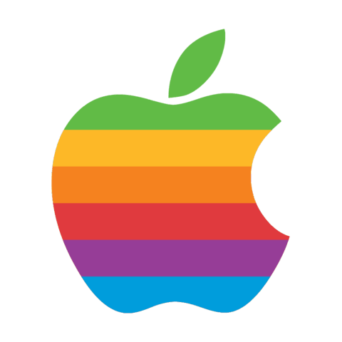 |
| Leaf solid green. Green shoulder. Six colours on the fruit. | Leaf two-tone. Yellow shoulder, and green never reaches the apple at all — five colours on the fruit. | Leaf solid green. Green shoulder. Six colours on the fruit. |
The 1977 logo, designed by Rob Janoff, from Wikimedia Commons — public domain in the United States as a work below the threshold of originality, and an Apple trademark regardless.
Side by side it stops being a matter of taste. Every boundary in the middle apple sits too high, and the green has been spent somewhere you can’t see the point of it.
Striping the wrong rectangle
The drawing code was about as simple as drawing code gets. Take the Apple glyph, clip to it, divide its bounding box into six equal bands, fill each with its colour:
let stripeHeight = pathBounds.height / CGFloat(stripeColors.count)
for (i, color) in stripeColors.enumerated() {
    let y = pathBounds.maxY - stripeHeight * CGFloat(i + 1)
    let rect = CGRect(x: pathBounds.minX, y: y,
                      width: pathBounds.width, height: stripeHeight)
    context.setFillColor(red: color.0, green: color.1, blue: color.2, alpha: 1.0)
    context.fill(rect)
}
Six colours, six equal bands, top to bottom. It even looks right at menu-bar size, which is how it survived so long.
The flaw is pathBounds — the bounding box of the whole glyph. And the glyph is not just the apple. It’s the apple and the leaf, and the leaf stands well above the fruit.
Here are the numbers, measured off the original: the 1977 apple’s body is 116px tall, divided into six bands of 19.33px each, with the leaf solid green throughout. Mine was 180px of glyph in bands of 30px — and the top 30px was almost entirely leaf.
So the whole of the green band was being spent on the leaf and the sliver of air beside it. The leaf itself was tall enough to run past that boundary into the yellow, hence the yellow tip. Every subsequent boundary was pushed up by the height of the leaf. And the fruit — the part everyone actually looks at — got five colours instead of six, starting with yellow where it should have started with green.
One wrong rectangle, and the logo had been wearing the wrong colours since the first build.
Splitting the fruit from the leaf
The fix is to stop treating the glyph as one shape, because the original doesn’t. The body gets striped in sixths of its own height; the leaf gets the top band’s green, in full, as a solid.
Getting there means taking the glyph apart. CGPath will walk itself element by element, so each moveToPoint starts a new contour and everything after it belongs to that contour:
static func split(_ path: CGPath) -> (body: CGPath, leaf: CGPath?) {
    var contours: [CGMutablePath] = []
    path.applyWithBlock { element in
        let e = element.pointee
        switch e.type {
        case .moveToPoint:
            let contour = CGMutablePath()
            contour.move(to: e.points[0])
            contours.append(contour)
        case .addLineToPoint:
            contours.last?.addLine(to: e.points[0])
        case .addCurveToPoint:
            contours.last?.addCurve(to: e.points[2],
                                    control1: e.points[0], control2: e.points[1])
        ...
        }
    }
    ...
}
Then: the largest contour by area is the apple. Any contour that rises above the apple’s top edge is the leaf. Anything else — the bite, if a font ever expresses it as its own contour rather than as a notch in the outline — is body. And if there’s only one contour, the whole path is the body and there’s no leaf to worry about, which keeps things safe if the glyph ever changes shape underneath me.
I checked the result against the original the same way I found the fault. Band boundaries now start at 0.00, 0.97, 1.99, 3.00, 4.01 and 4.99 sixths of the apple’s height; the 1977 logo’s are at 0.00, 0.98, roughly 2, 3.00, 3.98 and 4.97. Leaf: 100% green. That’s within a fraction of a percent on every band, and the remaining error is mine for measuring a scan by hand rather than the drawing being wrong.
A hairline that wasn’t there yet
One more detail, which is the sort of thing that only bites once you’ve fixed everything else.
The body is 142px tall in the render. A sixth of 142 is not a whole number. So if you draw six abutting rectangles, each boundary lands on a fractional pixel, and two neighbouring fills that share an edge will each anti-alias against the background rather than against each other. The result is a hairline seam — a one-pixel ghost line between the bands, faint, and absolutely there once you know to look.
The fix is to stop drawing bands and start drawing overlaps:
for (i, color) in stripeColors.enumerated() {
    // Paint each band from its own top edge all the way down, top colour
    // first, so later bands overwrite earlier ones.
    let top = bodyBounds.maxY - stripeHeight * CGFloat(i)
    let rect = CGRect(x: bodyBounds.minX, y: bodyBounds.minY,
                      width: bodyBounds.width, height: top - bodyBounds.minY)
    context.setFillColor(red: color.0, green: color.1, blue: color.2, alpha: 1.0)
    context.fill(rect)
}
Green paints from its top edge all the way to the bottom of the apple. Yellow paints from its top edge to the bottom, over the top of the green. Orange over that, and so on down. Every rectangle is full-height, every edge except the first lands inside already-painted colour, and there is no boundary anywhere for the background to leak into. No seam, at any size, on any display.
Part three: the icon had it too
Then the obvious thought arrived, about a minute too late to feel clever: the app’s own icon is a picture of the same logo. Rendered from the same view. With the same bug.
It was. Green swallowed by the leaf, yellow shoulder, the lot. Sitting in the Dock and on the download page, wrong, in exactly the way I’d just spent an afternoon proving was wrong.
So the icon was re-rendered from the fixed view. The fiddly part was making it a genuine drop-in: the artwork had to occupy the same box as the icon it replaced, so nothing about the composition shifted. That meant calibrating the font size until the bounding box came out at 303×362 within a 512-point canvas, with 105 and 75 point margins — matching the outgoing icon to within a pixel. Measured on the new artwork, the bands start at 0.00, 1.01, 1.99, 3.00, 4.01 and 4.99 sixths, and the leaf is entirely green.
Same picture, same place, right colours. That went out as 2.0.12, twenty-five minutes after 2.0.11.
Part four: and then I took the photograph twice
The README screenshot showed the old logo, complete with its yellow shoulder, blown up in a callout so you could admire the detail of the mistake. So I retook it with HawkEye against the fixed build — on the external display, at 1×.
The menu-bar logo in that shot is 18×21 pixels. Blown up in a callout, it’s 18×21 pixels with the corners smoothed off: an upscale of an upscale, which is a poor advertisement for an app whose entire pitch is this glyph, but correct. So I took it again on the built-in Retina panel, where the same logo lands at 40×37 real pixels and the callout carries actual detail. Two commits for one screenshot, and the second is the reason the download page now shows what the app really looks like rather than an approximation of it.
The theme, if there is one
Two bugs, one afternoon, and they rhyme.
The first one existed because I asked a reasonable question of the wrong participant. Who owns the menu bar? is not the same question as who is frontmost?, and for a year those two questions happened to have the same answer, so I never noticed I’d conflated them. It took an app with an unusual shape — an agent with a focusable window — to pull them apart.
The second one existed because I drew a box around the right idea and the wrong pixels. Six equal bands across the logo is not the same instruction as six equal bands across the apple, and the difference is a leaf.
Neither was subtle once seen. Both were invisible for as long as I was looking at my own work and finding it satisfactory. The vanishing needed another app to reveal it; the colours needed the original held up alongside mine, magnified, where I couldn’t give myself the benefit of the doubt.
That’s the whole lesson, I think. You cannot proofread your own assumptions from the inside. At some point you have to put the thing next to the thing it’s meant to be, and look.
The release is shipping now — via the built-in updater, the download page, or Homebrew, whichever you prefer.
brew install --cask perpetualbeta/jorvik/rainbowapple